What is a Call-to-Action?

Call-to-action (CTA) buttons tell your website visitors what to do while leading them further along the buyer's journey. As the name implies, CTAs urge your visitor to take an action: download, sign-up, enroll, subscribe, click, learn more, buy now...
There are the two essential elements to inbound marketing:
- Drive traffic to your website
- Convert that traffic into new leads or customers
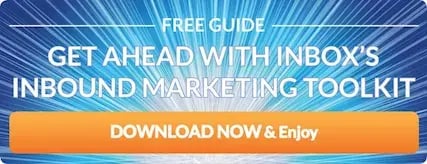
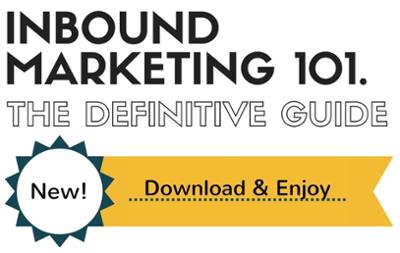
CTAs are an important part of the "convert" element. In order to convert a visitor into a lead, you need for that visitor to identify themselves. The best way of getting a visitor to identify themselves is to offer something of value in exchange for their name and email address. Below is an example of example of a CTA button that we have successfully used in the past.
However, the lead-up to the CTA is just as important as the actual CTA button. You need to explain to your visitors what you are offering and how it will actually benefit them. This helps you pre-qualify your potential customers, and gets these potential customers excited about what you have to offer. The CTA button is the final instruction you give your visitor leading to the final goal: Getting them to click . In order to motivate your website visitors to take the click plunge, use the following best practices.
- Create a no-obligation, no-risk statement (e.g. free, no strings attached, complimentary, money-back guarantee)
- Tell people what benefits they can expect (e.g. transform your organization, increase leads, simplify your process)
- Request an immediate action (subscribe, download, schedule a time, show me)
Your CTA buttons need to make people want to click, so be sure to create a compelling reason for them to do so. We have created a list of hints and examples that will help you create awesome CTAs. Obviously, you can't incorporate every hint into a CTA but use the following hints to inspire you.
1. Try using the customers voice with actions verbs such as "Show me", "Help me now! or "I want to XYZ".
2. Use imagery that compliments the offer. For example, use water imagery on your CTA for a download on the top tips to keep your pool clean.
3. Use friendly approachable language which emphasizes a mutual relationship, ie "Talk to us."
4. Use an exclamation mark (sparingly). The use of an exclamation mark lends itself to excitement. For example, if you are offering a service or a demo your might use "Let's do it!" on your CTA.
5. Use casually persuasive language such as "Give us a try" rather than "Start a free trial."
6. Try to incorporate some fun into your CTAs. One of our favorites is "Be Awesome." Afterall, who doesn't want to be awesome.
Calls-to-action are an essential element of inbound marketing, and are all about putting the right message in front of the right people. Experiment, be patient, and put your best foot forward. If you would like more information about creating great CTAs, give us a shout. The first half-hour consultation is always free.

